The guiding principal behind the design of a Rohit Communities home is “to help you feel better about where you live.” When you walk into a home for the first time, it either feels just right or not (think Goldilocks). When you’re house-hunting, you know you’ve found the next place you’ll call “home” when you get this feeling.
Rohit takes this very seriously. That’s why we want you to feel better about where you live. Our homes are purposefully designed so that to maximize the livable space, meaning we give you the most out of the square footage in your new home.
Better ways to use space
Who wants a home where furniture doesn’t fit or has awkward angles or stairways so narrow that you can’t move a couch or mattress.
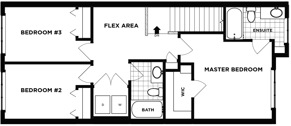
For example, the upper hallways in a Rohit home. According to Anja Porsche, Manager, Product Design for Rohit, our “second floors have only short hall ways, so more space is used for bedrooms or storage. We don’t waste space for corridors, although we keep in mind how to move the furniture in and out.”
She continues by saying that “We prefer to open up traffic areas into flex spaces for additional use and purpose, like office desks, play areas, reading corner, TV, etc.”
For instance, in the plan below, have turned corridors into a flex area. Think about all you can do with this multi-functional space. Use it as a kid’s play area, a home-office, yoga studio or whatever you’d like!

We’ve also purposefully designed the washer and dryer to be upstairs to make it more convenient to do your laundry.
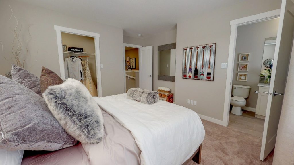
Anja also says that “We focus on bigger bedrooms and ample storage instead. Short hallways serve the means of room access and create a “private” entry, tucked away from main traffic.” It makes sense to turn otherwise wasted space (i.e. long corridors) into more useful space in the bedrooms.

The next time you walk into another home or go show home shopping, think of these little things (and Goldilocks). If it feels right, then it probably is right.
